The buzzword “mobile responsive” gets thrown around more than a hand-tossed pizza crust these days. But what the heck does it mean? Today we’ll explain what a mobile responsive web site is and how to check your own site.
What is mobile responsive design?
Smart phones. Just about everybody has one. According to the Google, about 40% of all web traffic is surfing around on a tiny screen. And that number is continuing to grow. Research shows that mobile-friendly sites get more engagement than non-mobile sites. The writing is on the wall… Make your web site mobile-responsive or get left behind.
In a nutshell, mobile responsive design means that the layout of your web page adapts to fit the size of the screen. This usually means the layout shifts, the font sizes change and the menu moves to a more touch-friendly format.
Many people think that if a web site shows up on their smart phone then it’s “mobile responsive”. However, if your visitor has to do any finger acrobatics like “pinch zoom” or horizontal scrolling in order to read the content, then it fails the mobile responsive test.
In a mobile responsive design, the user should be able to easily scroll down the page and read the content. It will flow vertically and the size of the text should be at a fairly comfortable level. Any menus that existed before may now be tucked away behind a menu icon and easily accessible when tapped. Other layout elements may move from a column format to more of a stacked format.
Our site is mobile responsive. Here is what it looks like on a desktop:

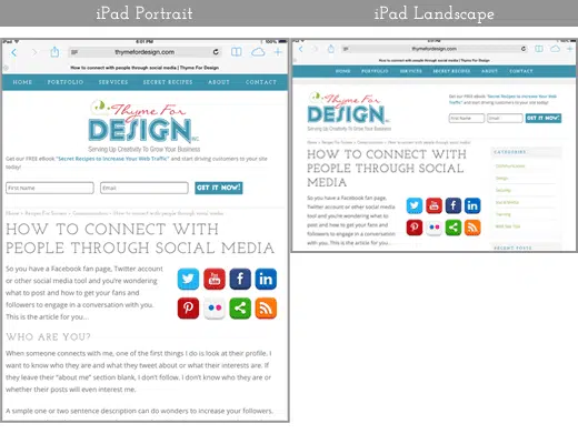
Here is what our mobile responsive site looks like on a tablet in both portrait and landscape mode. In portrait mode, you can see that the sidebar has now moved off the page and can now be found tucked under the content as you scroll down.
To see the real difference, here is an example of the site without a mobile responsive layout along with that same page WITH the mobile responsive layout applied.

Is your website really mobile friendly?
There are 3 easy ways to test your site for mobile responsive design.
- On a desktop computer, grab the right hand side of your browser and drag it over to the left until you have a very skinny column (about the width of a smartphone).
- Open your site on a smart phone.
- Go to http://quirktools.com/screenfly/ to see what your site looks like on other devices and screen sizes.
Here are a few simple things to look for when determining whether a design is mobile responsive:
- Did the elements in the page (header, footer, sidebars and images) adapt to fit the screen width?
- Is the text easy to read?
- Does the content flow vertically?
- Is the menu easy to navigate on a touch screen?
- Did the images resize to fit the screen?
If the answers to all the above are yes, then reach around and pat yourself on the back for a job well done. You’ve got yourself a mobile responsive web site!
Did you find this article helpful? Share it with a friend or colleague who still has you pinch-zooming to read their content. Their update to a mobile-responsive design is a win-win for you both.