At Left Right Labs, we work with fitness web sites every day. When we do site reviews for new clients, here are some common elements we look for to help our clients turn visitors into customers.
Photos
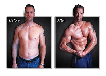
This may sound like a no-brainer, but photos are an absolute necessity on a fitness site. Nothing else gives people as much reassurance as seeing people who have achieved great results. Sure, YOU look great, but does it really work for other people? That’s what inquiring minds want to know!
Make sure you are getting good before and after photos from any program you are running and then SHOW THEM OFF on your web site. Here is a great example from one of our clients. Ben Booker developed the Razor Hybrid Fitness program to help people sculpt their bodies in an efficient and effective manner, using his patented Razor equipment. Before going live with the product on his web site, Ben needed some visual proof that his program really worked.
Using good lighting and a white background, Ben had a professional photographer take before pictures at the local gym where he was teaching the class. At the end of 12 weeks, Ben had another set of photos taken of those same participants to show their fantastic results. Those photos serve as proof that Ben’s program delivers.
Videos
In the fitness industry, customers want to know how you’re achieving such great results. They want to know what you’re doing in the gym and how you’re doing it. Video is a great tool to deliver what your customer is dying to know about your fitness routine.
Smart phones make it super simple to get great video. You can take video on the fly for a quick blog post or you can plan out a series for a product. You can also use video to capture what your clients are doing and show proper form. See this video from Ben Booker and Briana Michel for a great example of demonstrating an abdominal workout.
Here are some basic tips to be aware of when shooting video. Make sure you have adequate lighting and good sound. Do a test run of your video to make sure it looks and sounds good before shooting the full video. Use a tripod to make sure the camera is stabilized and check the frame to make sure there’s no background movement that could be a potential distraction. Also, make sure your camera is turned horizontally to fill the frame (landscape).
You can repurpose your web site videos for social media or vice versa. Ben Booker does a great job of this with his Instagram account. Video also gets a lot of engagement on Facebook so be sure to post your videos on all of your social channels.
Testimonials
This might sound like a no-brainer for a fitness pro, but you’d be surprised by how many sites we’ve come across that have NO customer testimonials.
This is probably the easiest item on the list to implement because all you have to do is ask 3-5 of your best clients to say nice things about you or your product and snap a quick photo of them. Text is the most important component here, so even if you can’t get a photo right away, you can still get a quote from a customer and drop it onto your page.
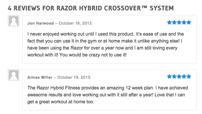
Also, product reviews make great testimonials and are very influential. Check out the reviews for Ben’s Razor Hybrid Fitness program. Now that’s social proof!
Where should you place your testimonials? In as many places as you can. Especially on product pages so your visitors can see what customers are saying about your product or program. Social proof carries a lot of weight and a few testimonials will go a long way.
Opt In/Lead Magnet
If you have a fitness web site and you are not collecting email addresses from your visitors, you are missing a huge opportunity. Email lists are gold in the online world. They are the most reliable and effective way to reach your customers digitally.
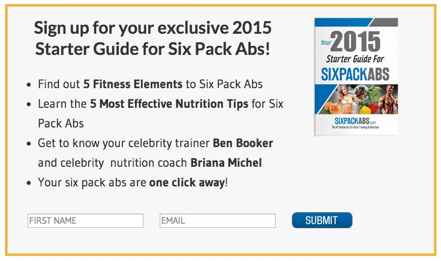
Your lead capture should be more than just a sign up box on your home page. It needs to be attractive and interesting. Not only that, but you need to offer something of value in exchange for that email address. Your offer is called your “Lead Magnet” and is usually something they can download and read or a video they can watch that provides them with some exclusive content.
A great example of this is on a site called Six Pack Abs (edit: Link was removed as they have recently been bought out by another company). They have a lead magnet called “Your 2015 Starter Guide for Six Pack Abs” which is a fantastic PDF that covers workout and nutrition tips for getting lean and building solid abs.
Mobile-Friendly

In a quick scan of the fitness sites we manage, more than 60% of traffic (and in some cases up to 80%) comes from smartphones or tablets. People are consuming content on-the-go and the number of mobile users increases daily.
As of April 2015, Google is now ranking sites based on whether they are mobile friendly or not. To see whether your site passes the mobile friendly test, paste your url into Google’s tool.
If you’ve been ignoring this issue on your site, contact us and we’ll make sure your site looks good no matter where your customers are finding you.


