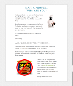
If you use a double opt-in, chances are you have a confirmation page set up on your web site. We’ve seen a lot of really boring confirmation pages. They usually go something like this:
“Yada yada yada… Please check your inbox.”
If you are using the default pop up message or page from your mailing list provider, you could be losing would-be subscribers whose eyes glaze over before they ever get to your call to action. Watch us whip up a great recipe for confirmation pages that convert by keeping the potential subscriber engaged in the content.
The following image is the confirmation page you see when you opt in to receive our “Secret Recipes to Increase your Web Traffic“. Click the image below to see it at full-size.
Our page is pretty funny and engaging, right? There are 3 main ingredients: a sprinkle of reassurance, a sweet reminder and a pinch to take action.
Reassurance
Even though your visitor may have submitted their email address, they might be having a little twinge of “what the heck did I just sign up for?” The first thing you want to do with your confirmation page is reassure them that they’re in the right place and what they are about to receive is worth exchanging their email address for.
While you’re sprinkling in the encouragement, this is also a good time to let them know what they can expect from you in future emails and that you don’t send spam.
Reminder
Online visitors sometimes get distracted. They may be returning to that browser window after an extra long lunch or after being interrupted by a phone call. Make sure you use your confirmation page to remind them what they are signing up for, especially if you have a Freemium to give away.
Action
Last but not least, you need to lead the visitor to take action. And with this step the best approach is just to tell them exactly what to do… go check their inbox!
Dish Up Your Own
There’s no special formula for which ingredient goes in first or how much of each one you use. Make up your own special blend of awesome sauce!
Above all, make it personable and fun. Keeping the entire opt-in process engaging is a key to high conversion rates!

