Client Brief
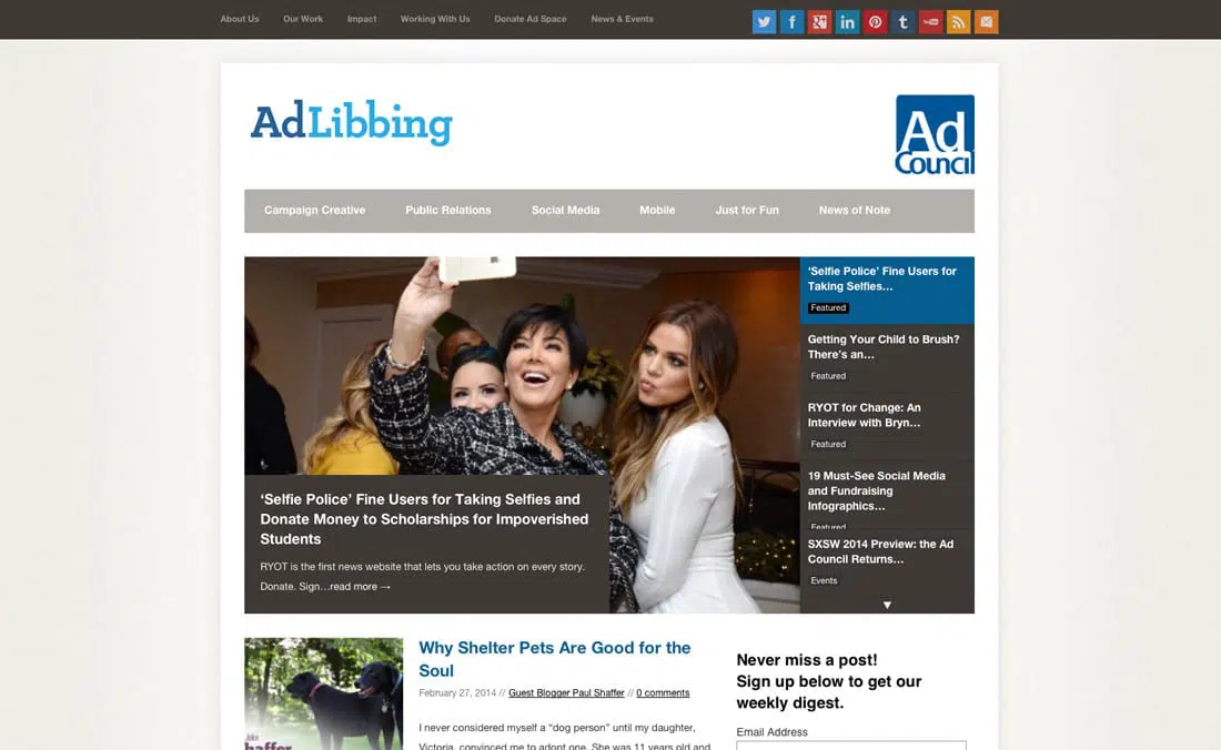
The New York Ad Council came to us wanting to update their company blog called “Adlibbing”. Their previous design came from a pre-made template and they were looking for a way to brighten the color scheme, integrate with their existing brand and organize the content to increase visitor engagement.
They also needed a major overhaul of their navigation system and article categories to make the site more appealing to their target audience.
Original Adlibbing Design
Our Approach
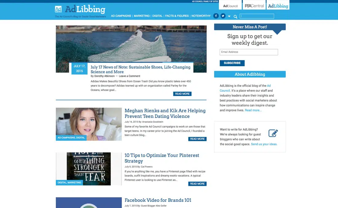
Our first challenge was restructuring the navigation. We consolidated several categories and condensed the menu into five top-level categories. We also completely revamped the header to include a simplified drop down menu for social media channels, their opt-in and added a search bar.
The color scheme was updated to match their brand colors. We did this both with the web site theme and with their email templates for consistency. The home page was also given a makeover to make the content easier to scan. We also overlaid the category on the image for a quick visual reference.

An updated author box was added under each post that listed the most recent articles by that same author, leading visitors to continue reading and browsing the site.
A callout for guest authors was added to the sidebar and we developed a clean landing page with a simple form for contacting the Ad Council.
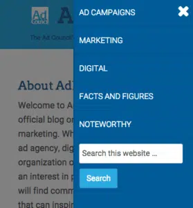
The entire site was optimized for mobile. The mobile menu was further condensed to show the top level categories and the search box remains visible for easy navigation on smaller devices.
Gretchen has been my go to WordPress gal at the last three non-profit organizations I have worked with. She is incredibly responsive, fast and most importantly is fantastic at coding.
I also use her update package to ensure our site is up to date. I have recommended her to several people and would continue to do so.
~Anastasia Goodstein, New York Ad Council
Results
After launching the new design, Adlibbing saw an almost instant increase in signups from the strategically placed opt-in forms. Their updated email template also displayed better on mobile devices, making it easier to read and gaining more click-throughs on the articles.
In optimizing the framework, the page load time was also improved by over 30%. This was a major benefit for Adlibbing’s mobile traffic and helped to meet their initial goal of increasing visitor engagement.
The Ad Council Team was extremely pleased with the new site and we continue to work with them to optimize and improve their results.


