

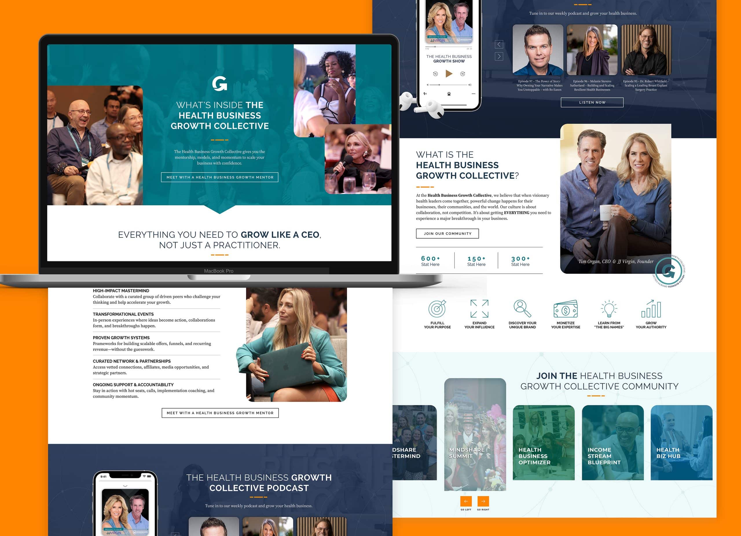
Left Right Labs just won two design awards from GD USA. One is for the CoreThera supplement packaging, and the other is a Health + Wellness award for the website we designed for JJ Virgin’s Health Business Growth Collective. We’re trying very hard to be humble about it, and it’s going about as well as you’d expect.
Both projects live in health and wellness, where a brand has to earn trust before it earns a sale. Here’s a look at what we built and why it worked.
CoreThera: supplement packaging that looks the part
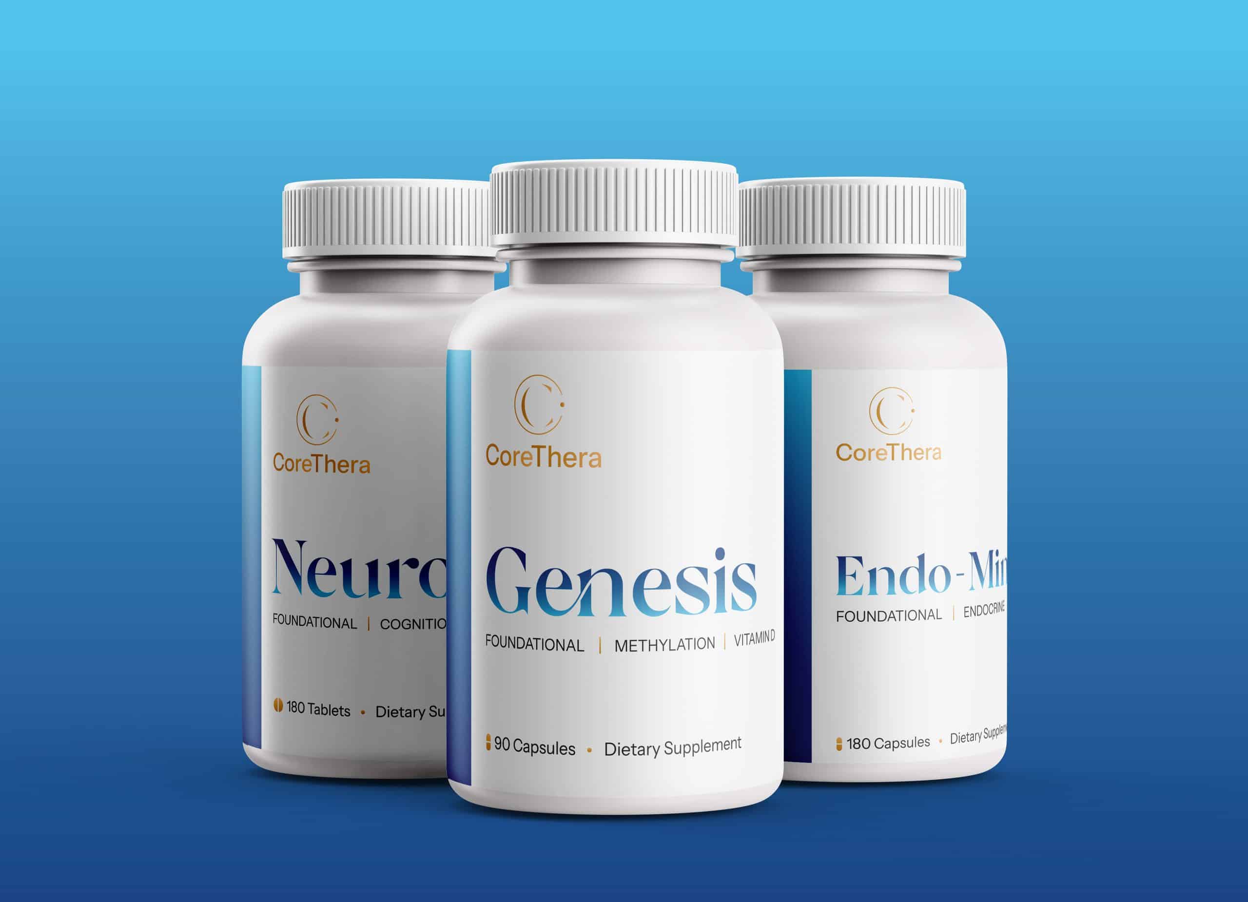
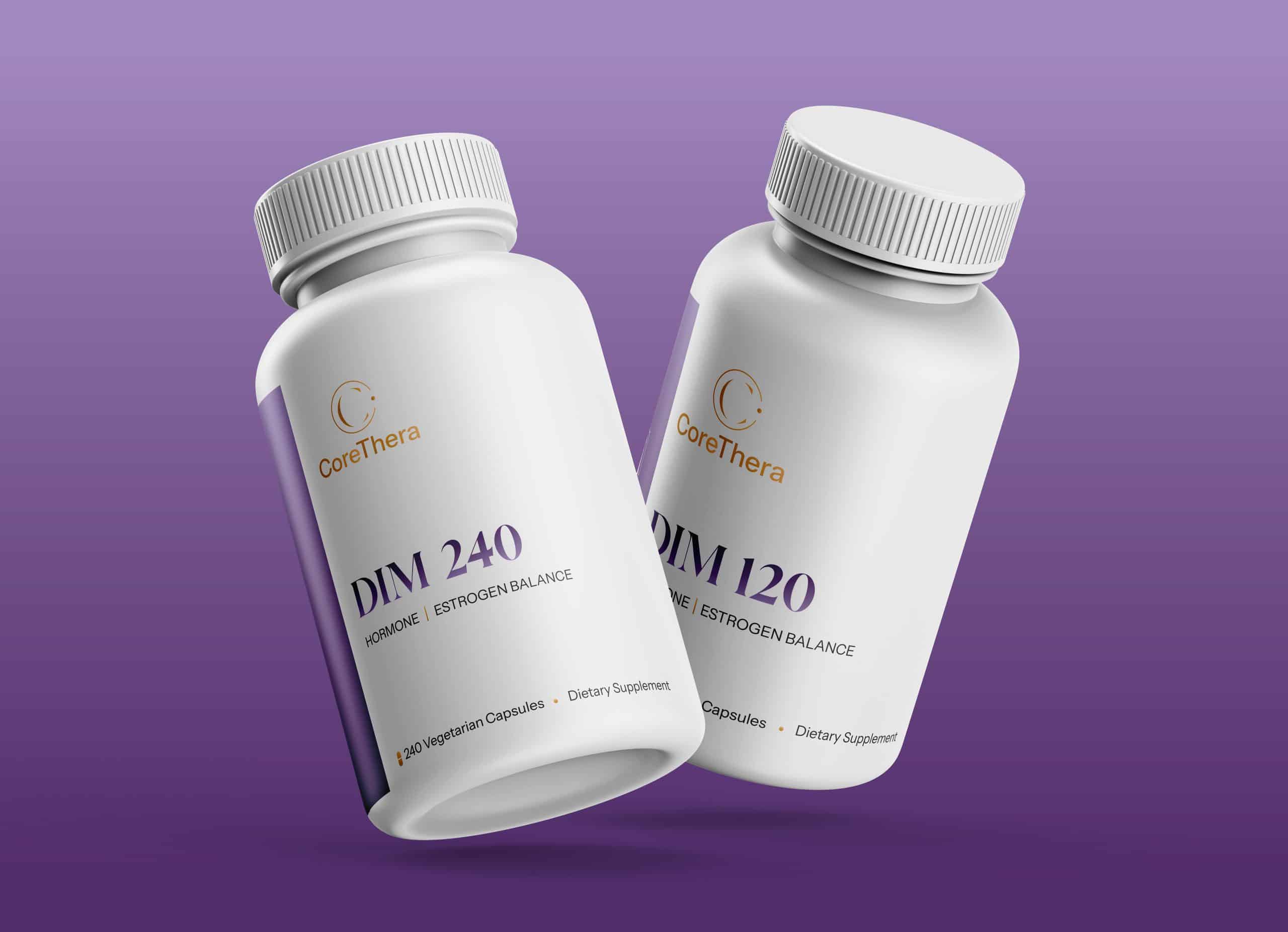
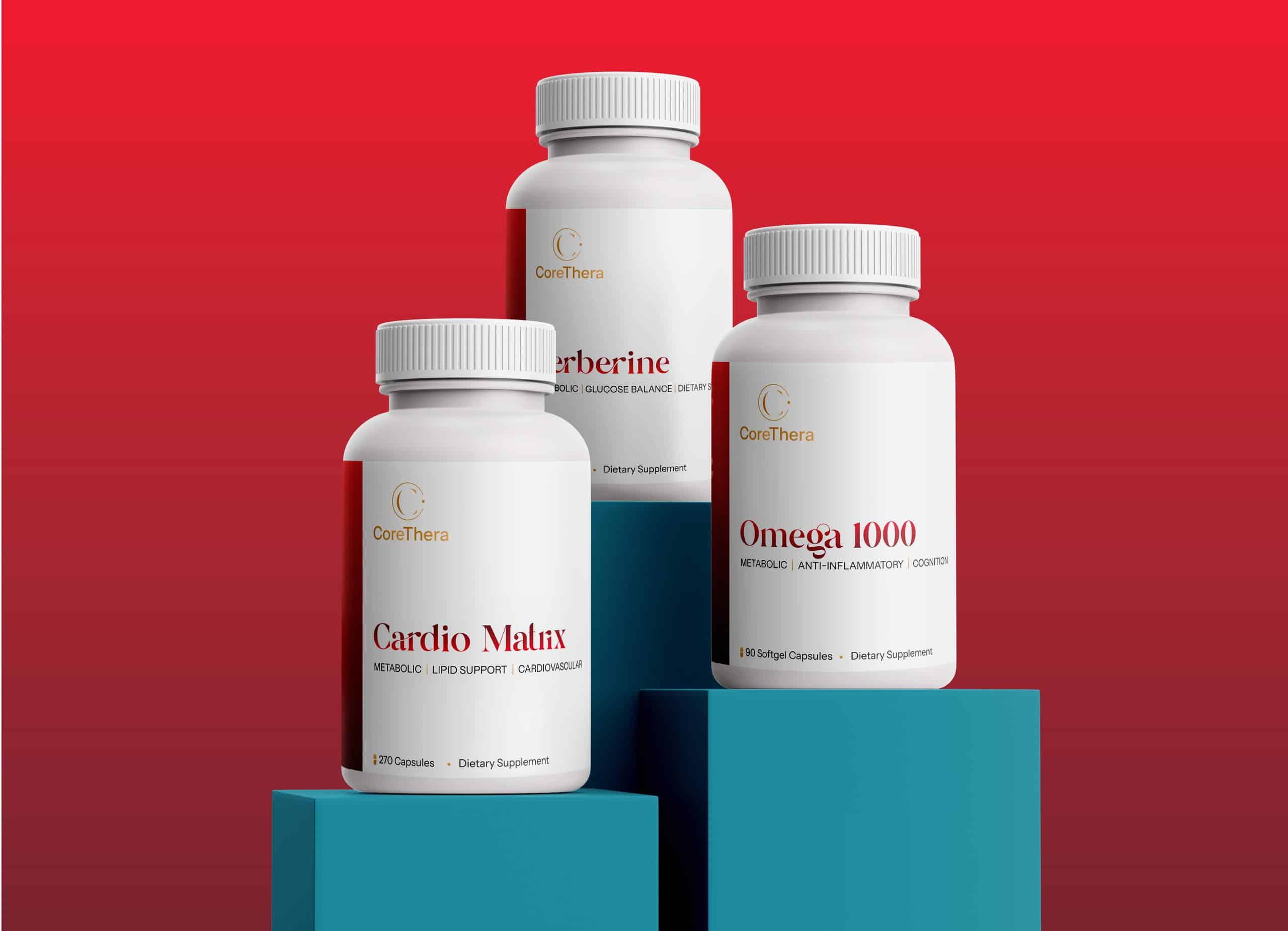
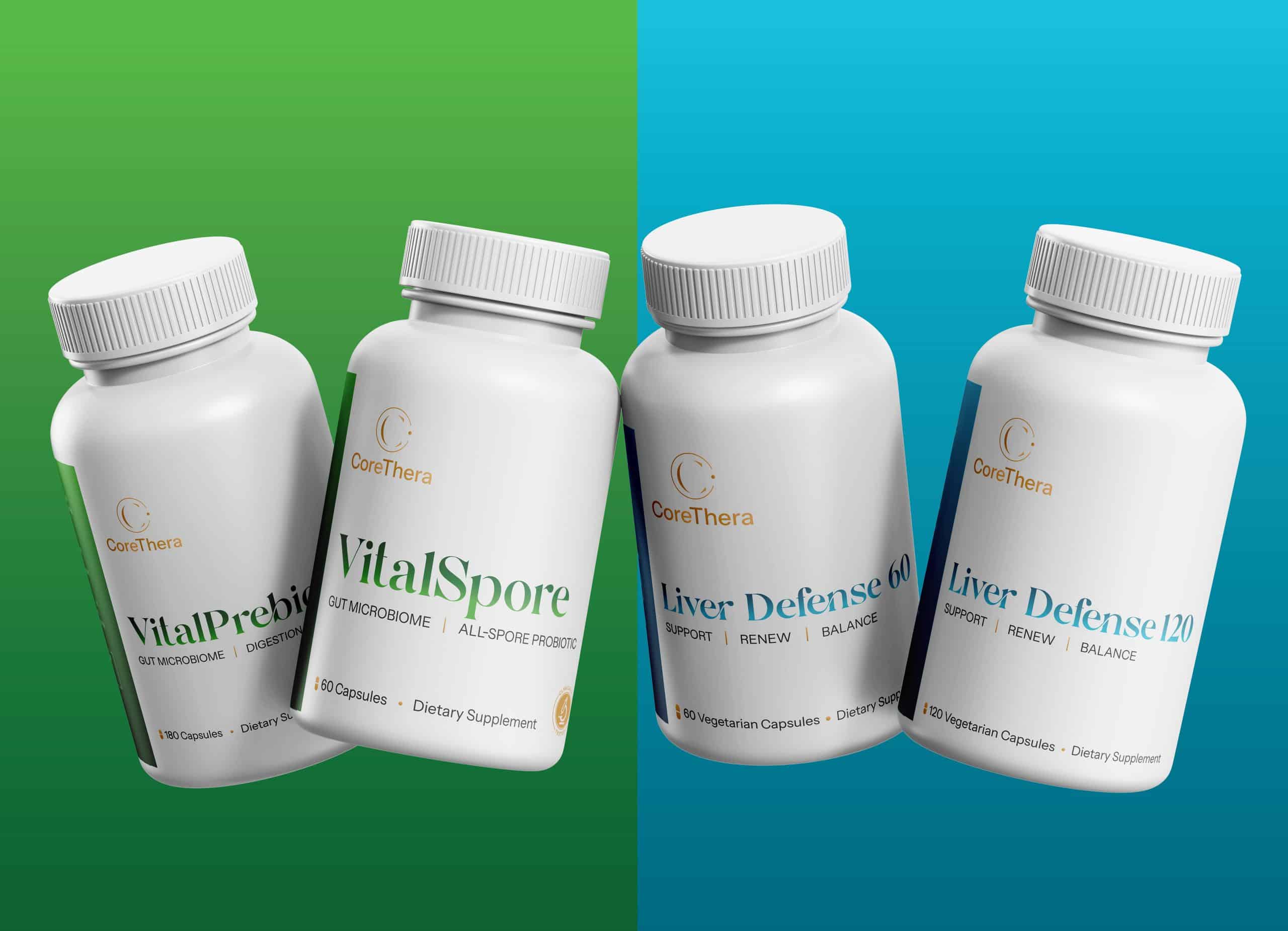
CoreThera is a clinician-formulated supplement line founded by Dr. James Smith, a DNP who specializes in nutrigenomics, and his wife Simone. Their brief was a tricky one. The bottles had to look credible enough for a practitioner’s shelf and warm enough that people would actually want them on the kitchen counter.
We gave each health category its own color lane: blue for the foundational line (Genesis, Neuro B+, and Endo-Mineral), purple for hormone support, red for cardio and metabolic, green for gut health, and teal for liver support. The gold CoreThera mark and the editorial serif type stay the same on every bottle, so the whole line reads as one family even when the colors change.
Each label also carries a short row of tags under the product name, like “Foundational | Methylation | Vitamin D” on Genesis. That lets a customer tell what a bottle is for at a glance, which matters a lot when you’re asking someone to build a daily routine around it.
For a brand this new, a GD USA award is a very big deal, and we couldn’t be happier for James and Simone.
Health Business Growth Collective: one home for a lot of programs
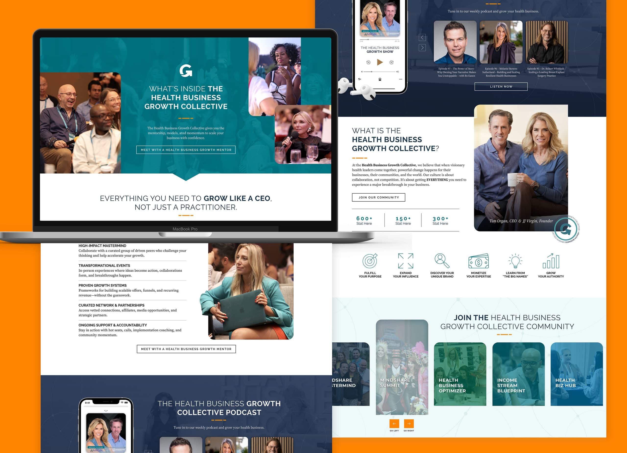
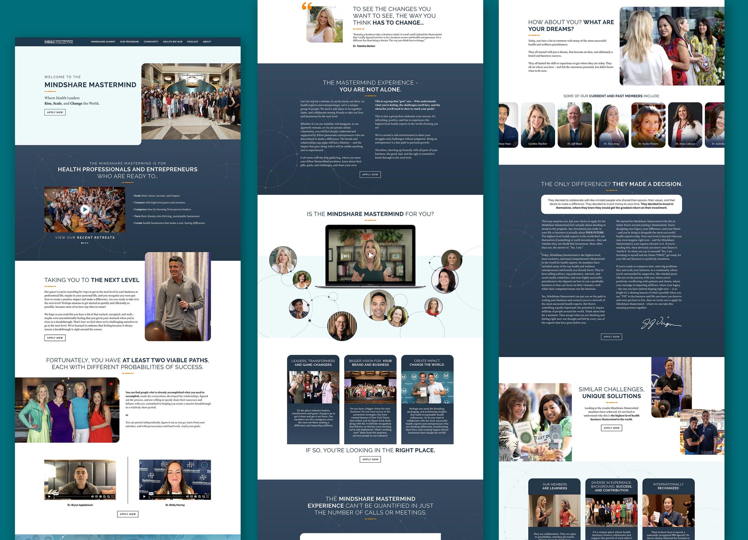
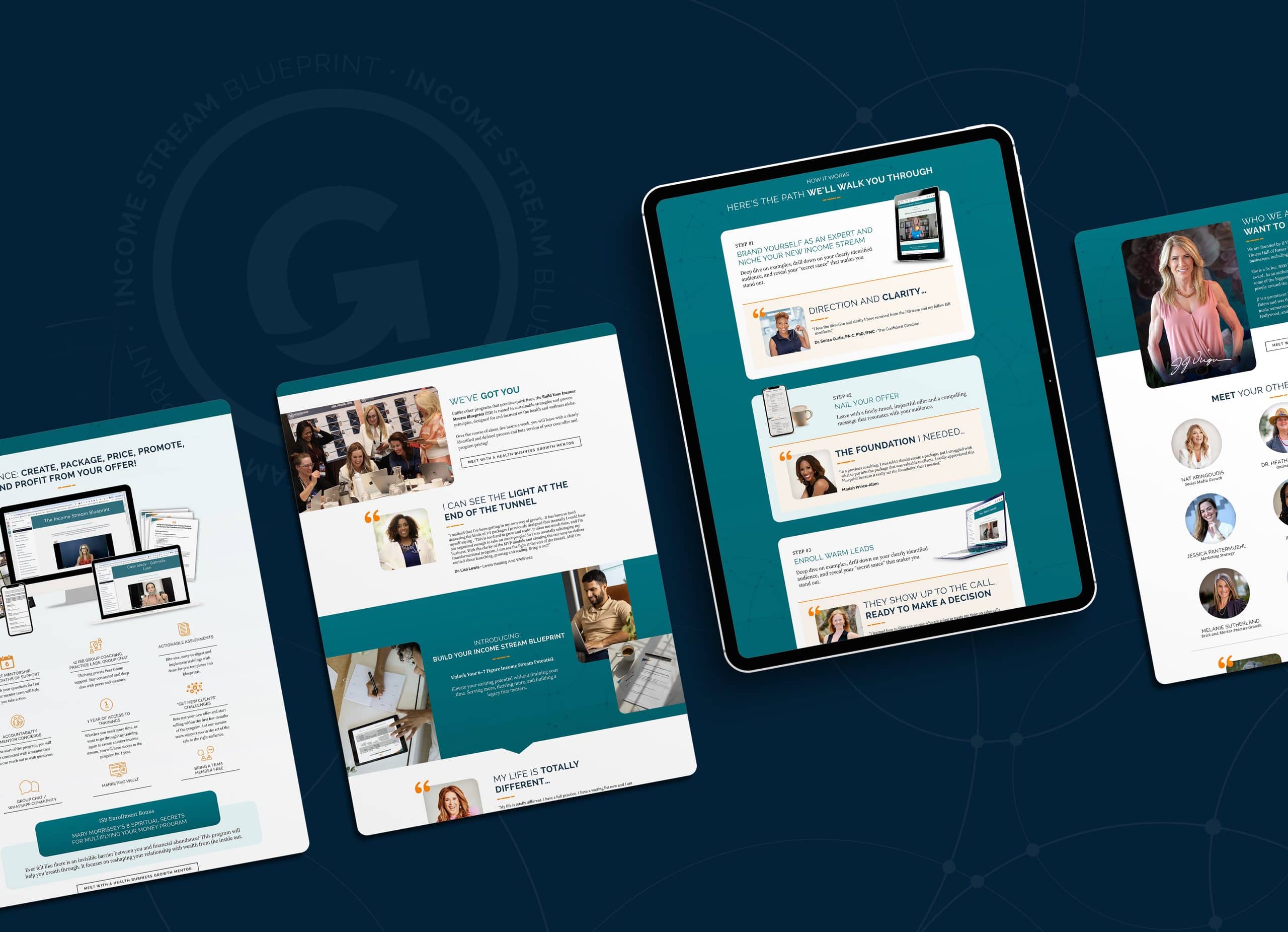
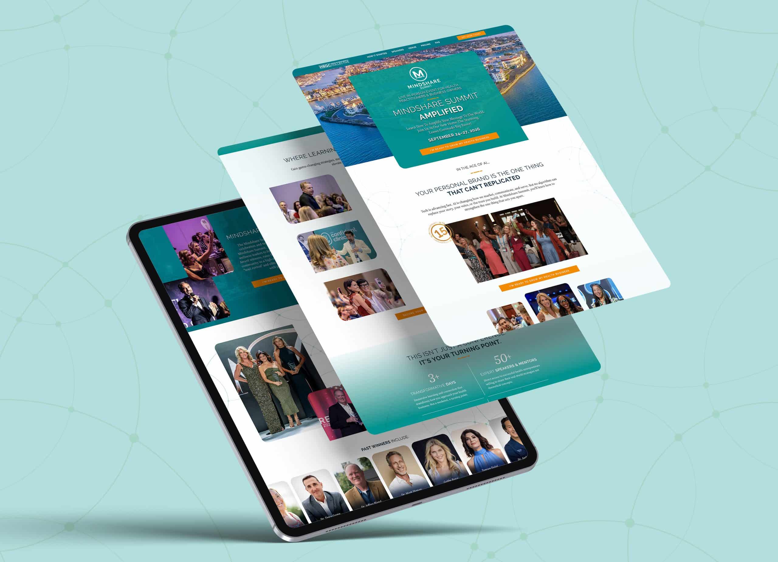
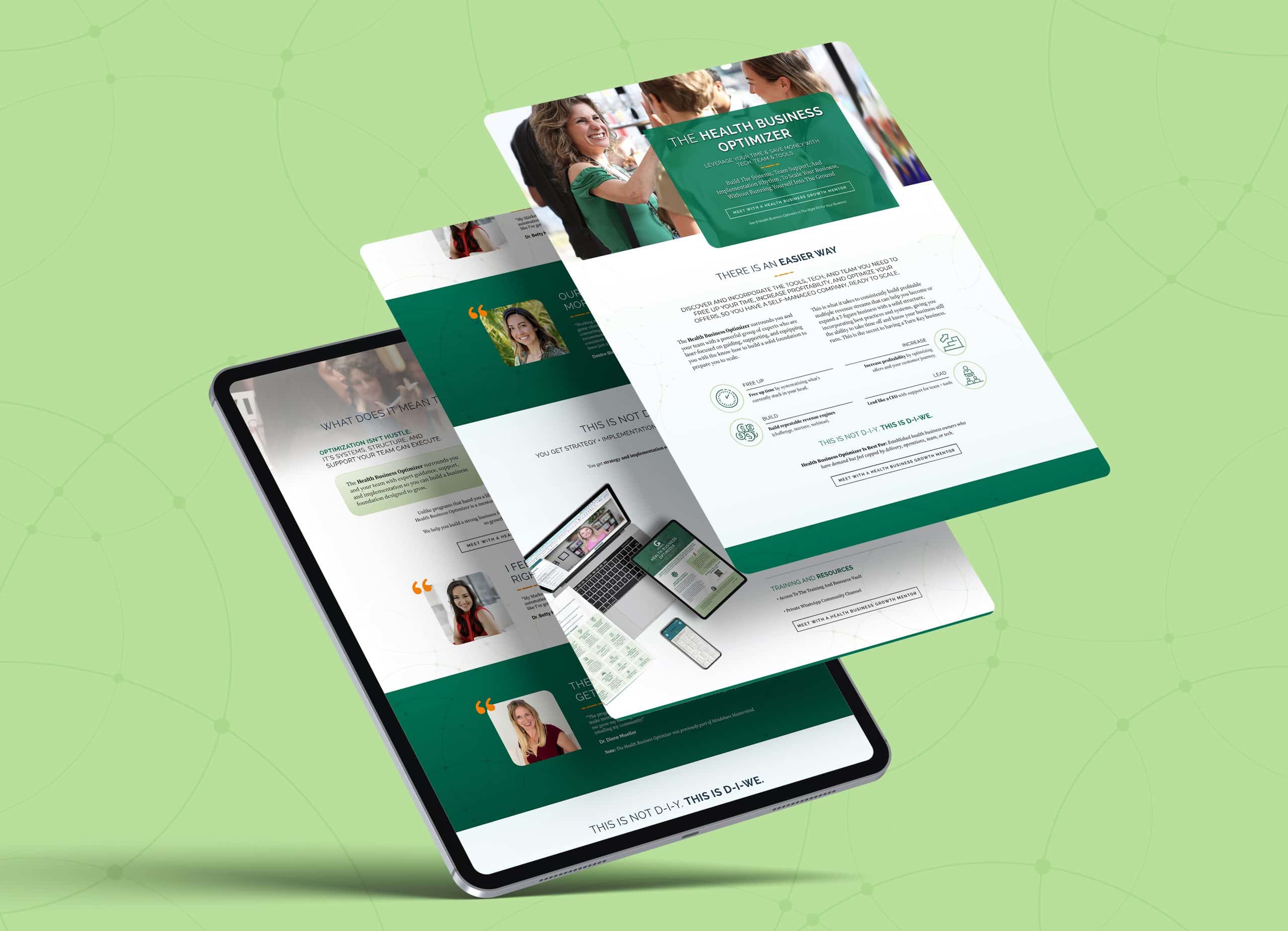
The Health Business Growth Collective is JJ Virgin’s community for health and wellness entrepreneurs, with JJ as founder and Tim Organ as CEO. It’s a big ecosystem that includes the Mindshare Mastermind, the Mindshare Summit, the Health Business Optimizer, the Income Stream Blueprint, the Health Biz Hub, and The Health Business Growth Show podcast.
The challenge was giving each program its own personality while making sure visitors always knew they were in the same house. We built a shared system of navy and teal with orange accents, rounded photo frames, and a subtle network-line pattern that runs through every page. Programs get room to stretch inside it, so the Health Business Optimizer leans green and the Mindshare Summit page opens on its Coronado Bay setting, while the type, layout rhythm, and “Meet with a Health Business Growth Mentor” call to action stay consistent everywhere.
That consistency is what lets someone move from the podcast to the Optimizer to a Mastermind application without feeling like they’ve wandered onto three different websites. GD USA recognized the site with a Health + Wellness design award, and building it with JJ, Tim, and their team was one of our favorite projects of the year.
Thank you to our clients
These awards belong as much to our clients as they do to us. James, Simone, JJ, and Tim trusted us with brands they’ve poured years into, and we don’t take that lightly.
If you’ve been wondering what your own brand could look like with that same level of care, we’d love to talk. Book a call with Left Right Labs.


