When we talk about “refreshing your brand” during a strategy call, most people jump straight to colors, fonts and a logo update.
Because those are the first things customers will notice when a brand changes.
But what about the next level?
The level where customers connect and engage with your brand.
The one where they “just get you” 10 seconds after landing on your home page.
How does a brand refresh get you THERE?
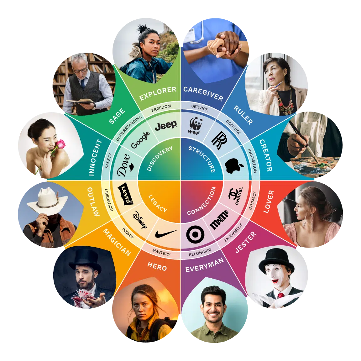
Take a well-known brand like Nike… they’ve refreshed their brand multiple times over the years.
But it’s still Nike. We all still recognize the swoosh.
With each iteration of their brand, did changing their color palette improve the appearance of the site?
Definitely.
Did the visual changes have a big impact on their conversions?
Not likely.
So what’s the point of a “brand refresh” if it’s not going to increase conversions?
Here’s what gets overlooked in every brand update… the change in user experience.
Refreshing your brand (the right way) is not just about getting a visual makeover, although that should definitely be part of the process.
A strategic brand refresh analyzes the whole user experience and makes calculated adjustments to improve the flow of content, simplify the navigation, optimize the page speed, streamline the scannability, and much more.
Think about what the web was like 20 years ago… 10 years ago… and even just 1 year ago.
A lot has changed.
If your website isn’t changing as technology advances, your visitors are left to struggle with last decade’s interface, stale content, outdated visuals, and an overall unengaging experience.
Those visitors won’t last long before they close that tab and search out someone else who looks relevant.
Don’t be the tab they close.
Be the one they leave open indefinitely because your service is amazing and your content is so good they keep coming back for more.

